Services Provided:-
Logo Design
Re-Brand Identity Design
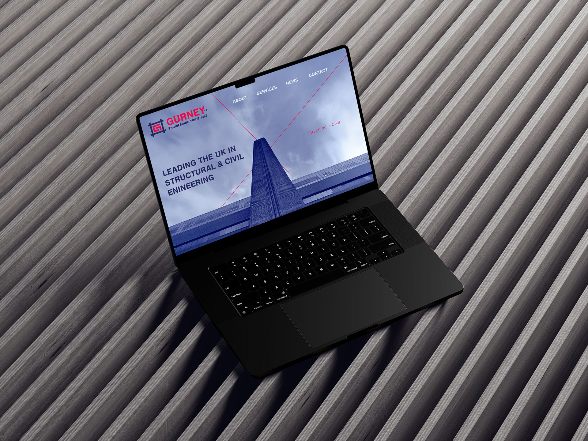
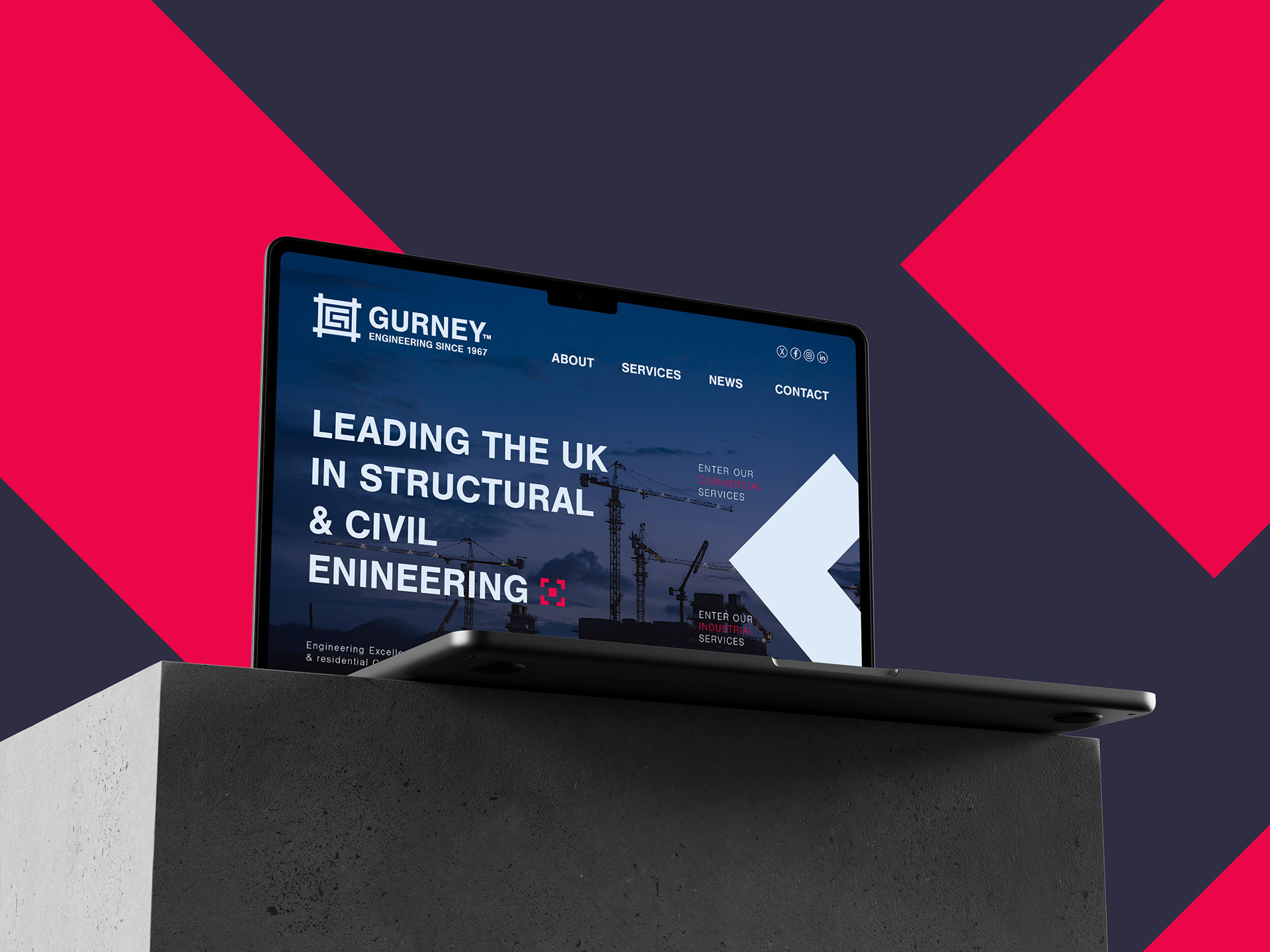
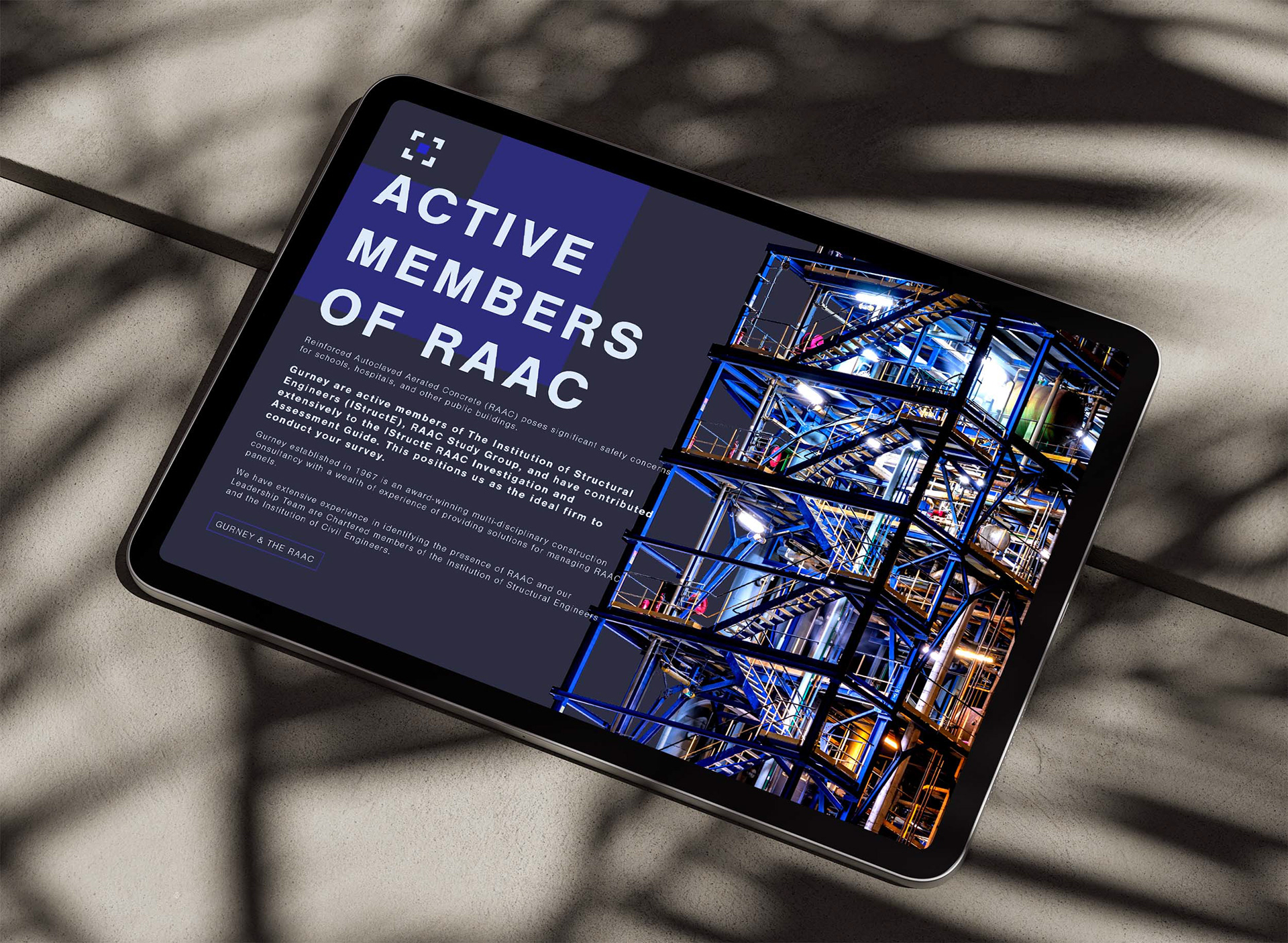
UI Design
The Re-Brand:
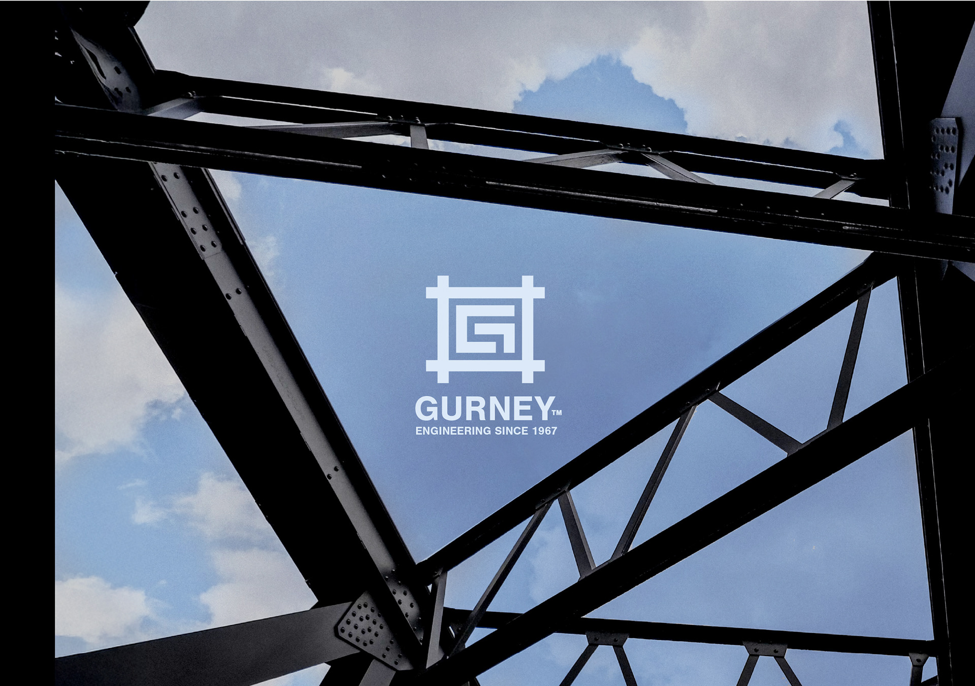
As a long-standing British construction company, Gurney Engineers had an established brand identity. However, its previous branding lacked the boldness and professionalism needed to reflect the company’s expertise and evolving role in sustainable construction. The outdated design failed to connect with the company’s forward-thinking vision. A rebrand was necessary—not only to create a stronger, more distinctive identity but also to subtly honor the company’s heritage by retaining key conceptual elements from the original logo.
The Solution:
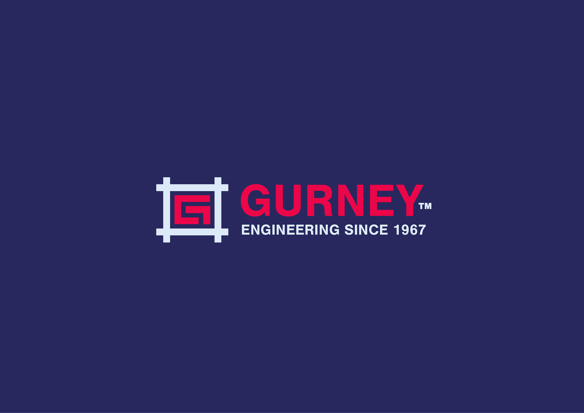
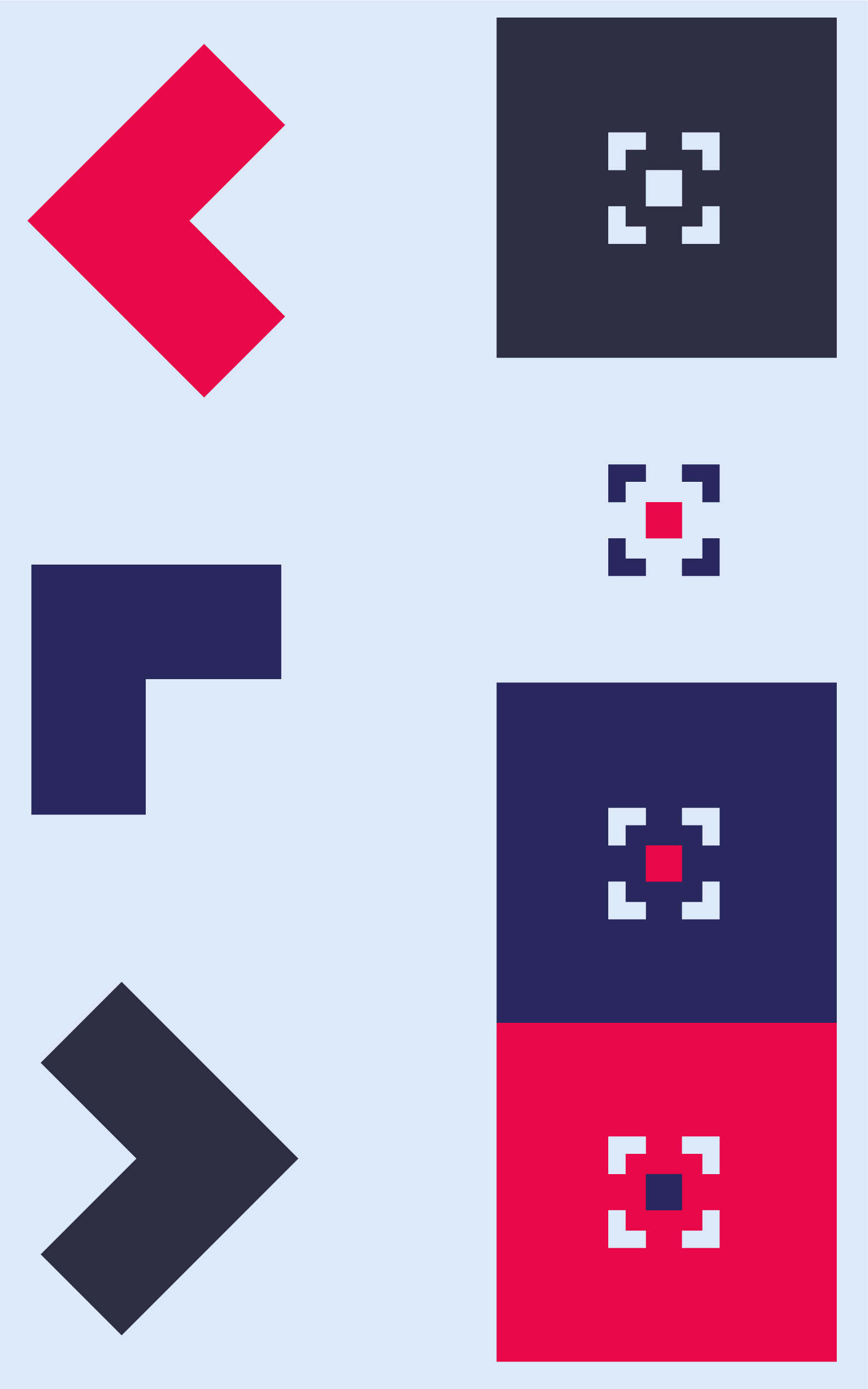
The redesigned logo retains the essence of Gurney’s past identity while modernising its execution. The cross-hatched square surrounding the ‘G’—a reference to scaffolding and technical drawings—remains a core element, ensuring continuity with the previous design. However, the new rendition embraces a bolder, more structured form, enhancing visibility, recognition, and impact. The thick, blocked-out elements symbolise the strength and stability of the structures Gurney helps to build. By blending minimalist modernism with a retro-industrial aesthetic, the logo pays tribute to the company’s heritage while confidently positioning it for the future.

Gurney Identity Accents
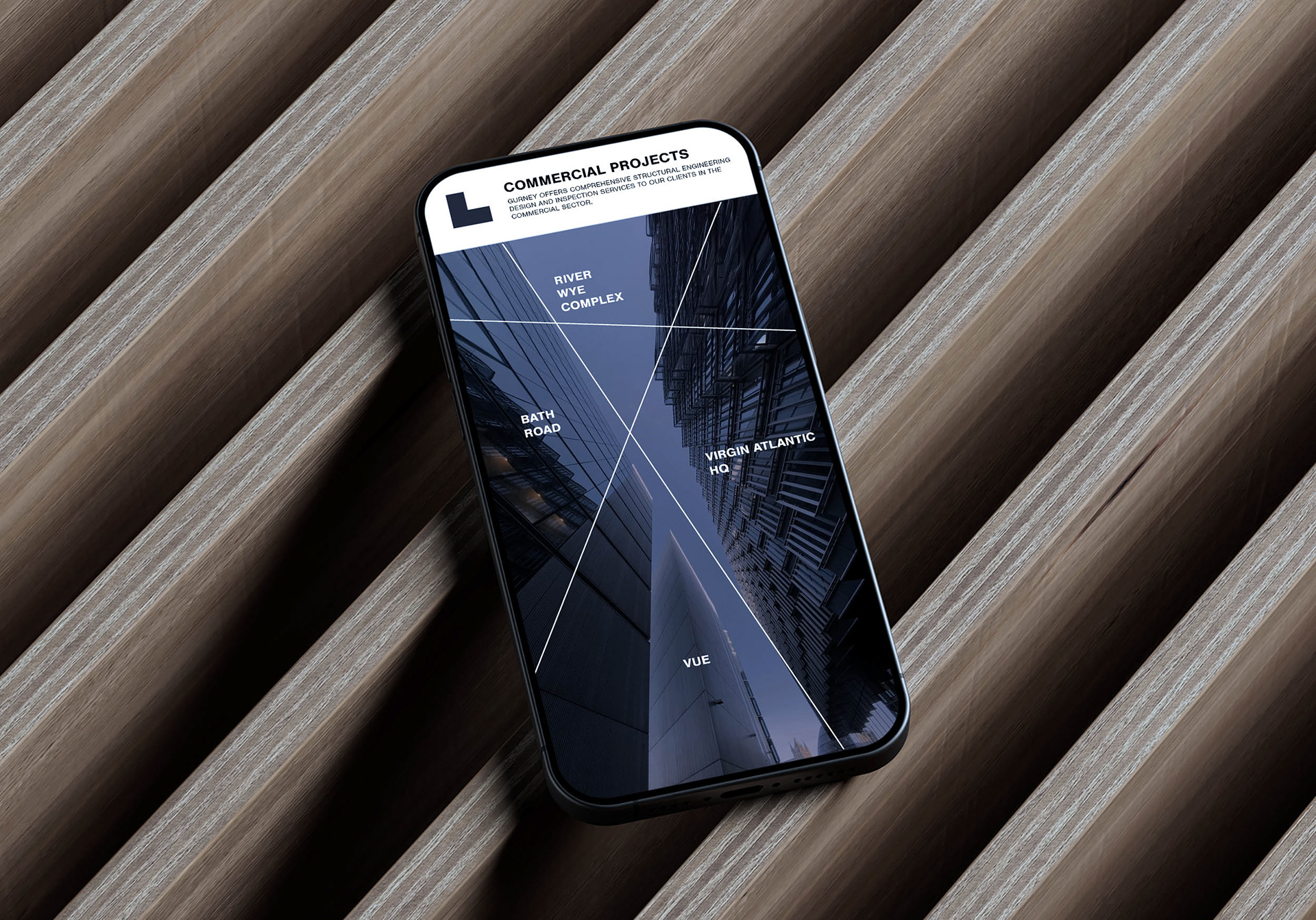
The graphic accents extend the re-brand’s visual language, reinforcing the bold, minimal aesthetic established in the logo. The shapes—derived from the blocked-out forms of the identity—serve as versatile assets that can be integrated across various media. They maintain a cohesive design system while adding structure and adaptability to the brand’s visual presence.
For these assets to be effective, they must adhere to a precise application system, including strict use of the brand’s colour palette, controlled scaling, and balanced placement within layouts. Consistency in these elements ensures the brand maintains its intended visual strength and clarity across all touchpoints. When implemented correctly, they create a refined and cohesive experience that aligns with the re-brand’s core design principles.adding structure and adaptability to the brand’s visual presence.