Services Provided:-
Logo Design
Re-Branding Identity Design
The Problem:
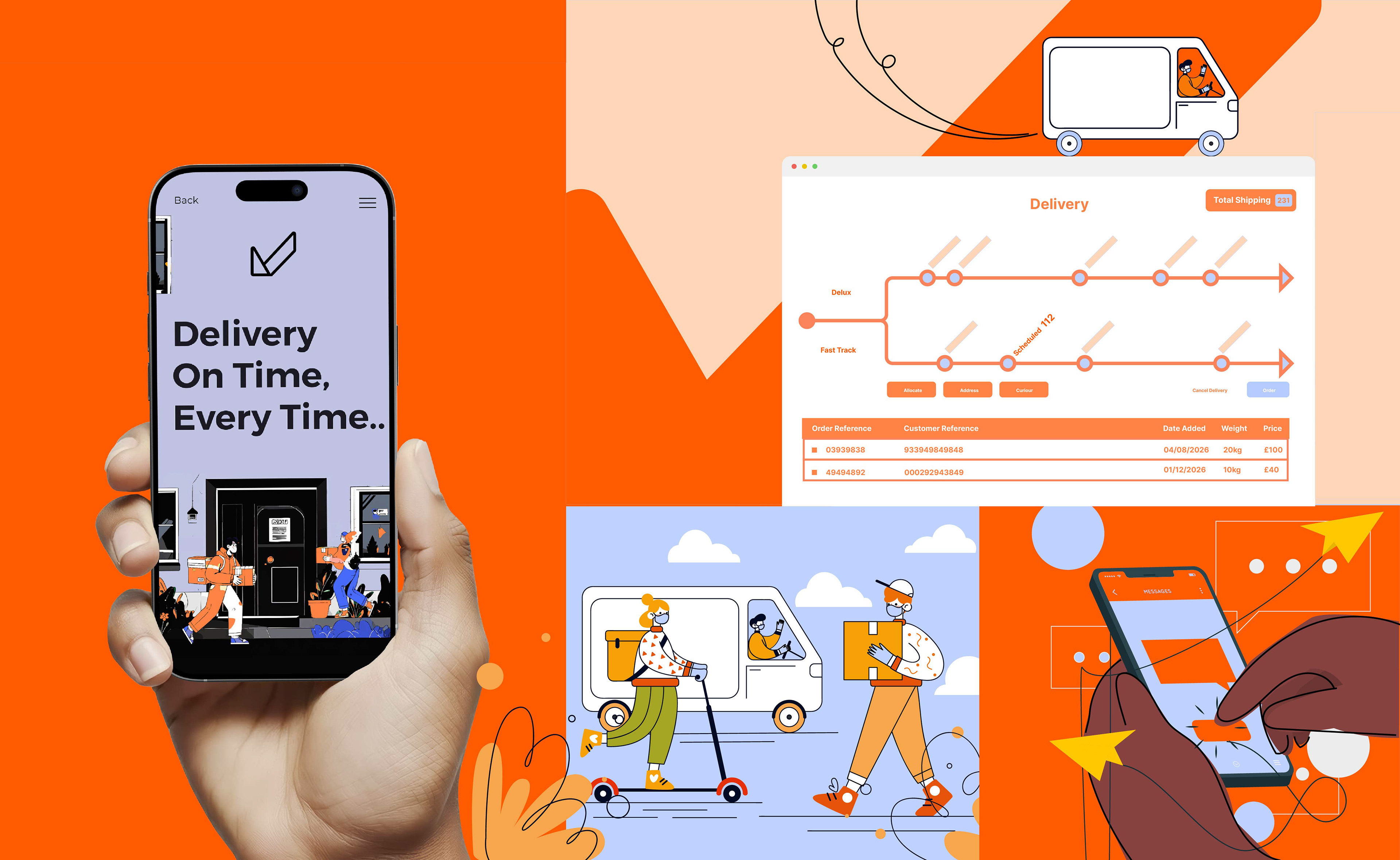
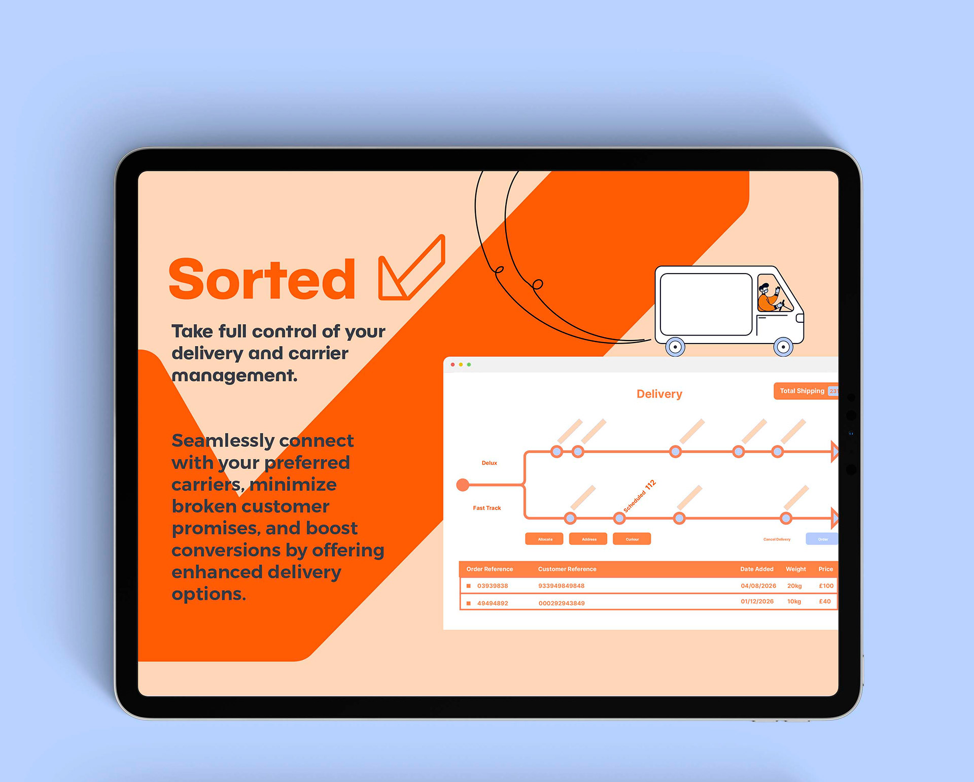
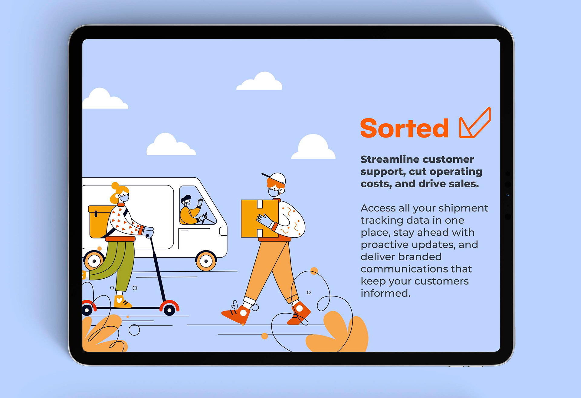
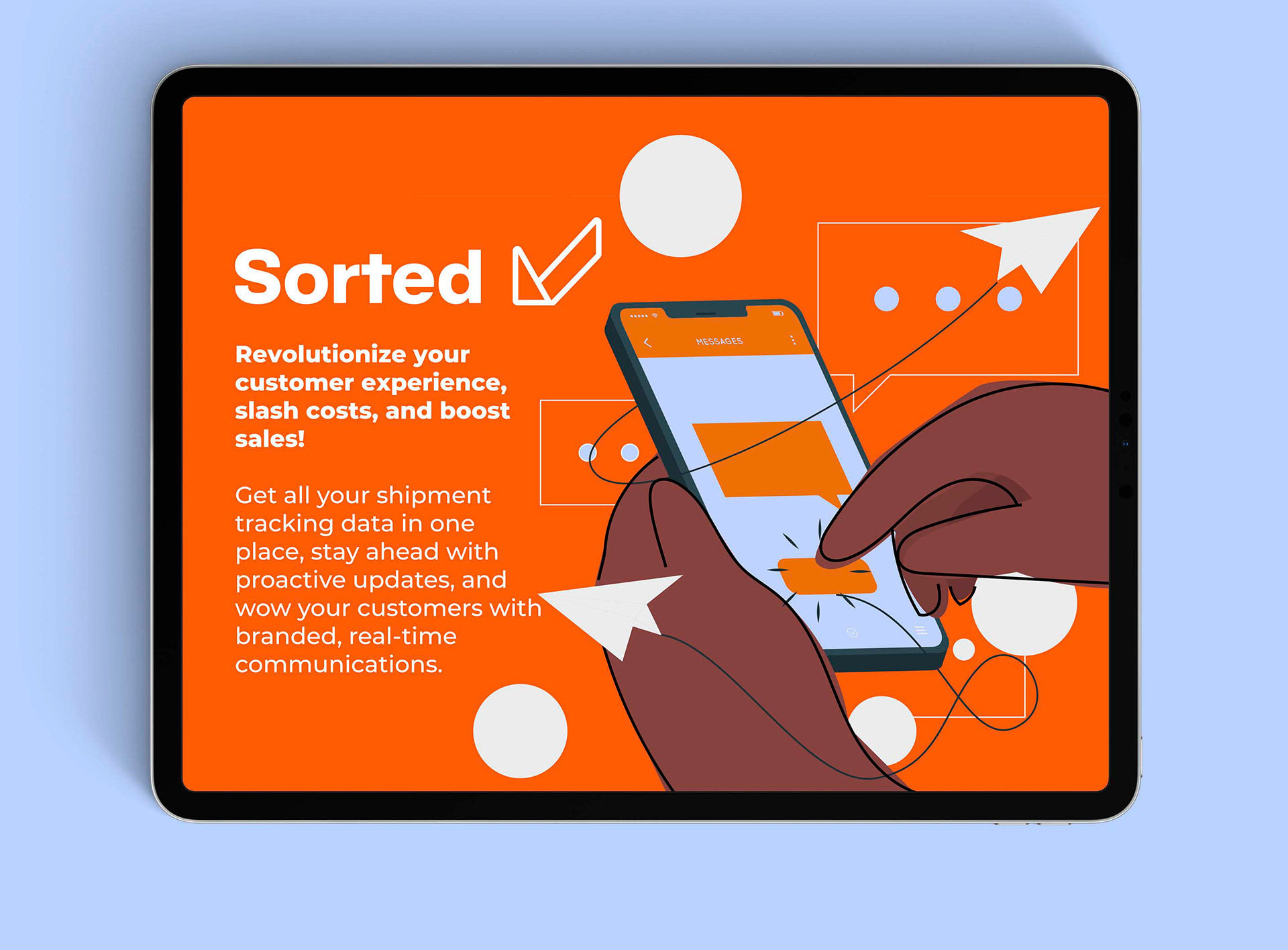
Sorted, a UK-based delivery platform offering postage and shipping management software for retailers and brands, needed a refined brand identity to match their expanding presence. Their existing visual identity lacked strategic direction: the logo conveyed the wrong message, and the colour palette failed to reflect the nature of their services. The brand needed a system that could communicate clarity, confidence, and capability — without relying on overused visual language seen across competitors.
Complicating the process were strict visual constraints: key colours such as red, pink, and anything too closely aligned with industry competitors were off-limits. Rather than hinder the outcome, these restrictions became a creative anchor, guiding a more focused and original solution.
The Solution:
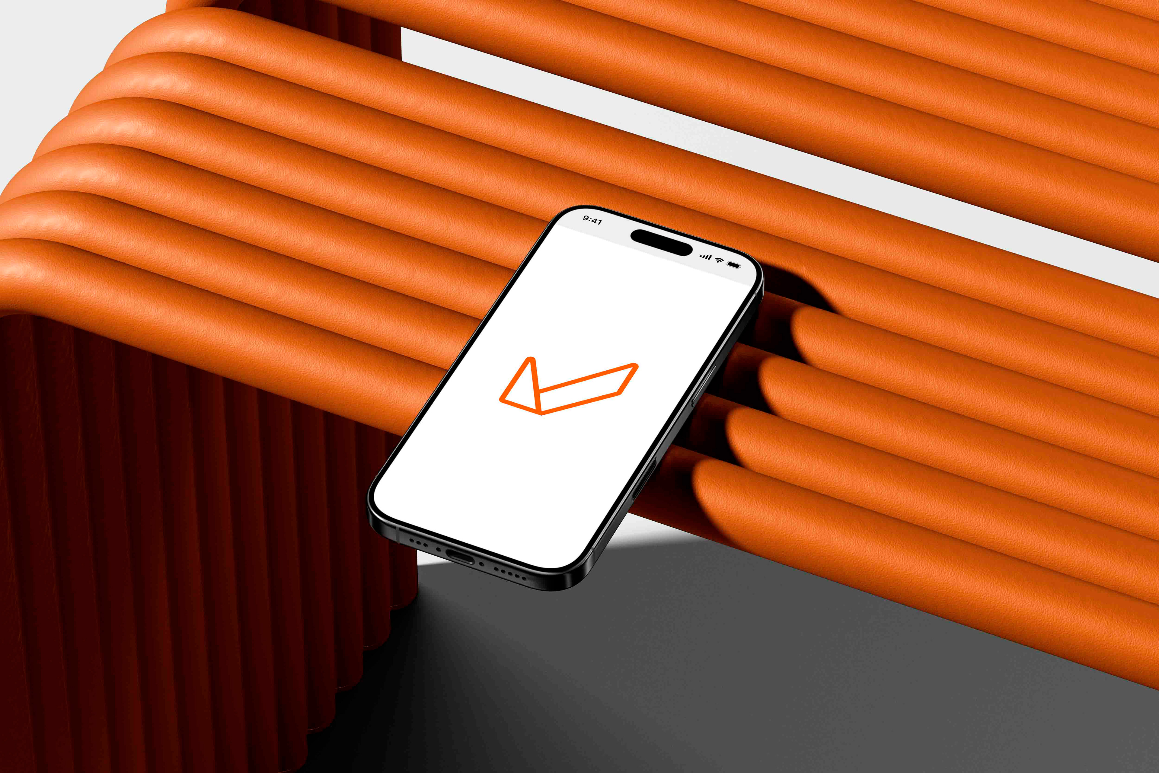
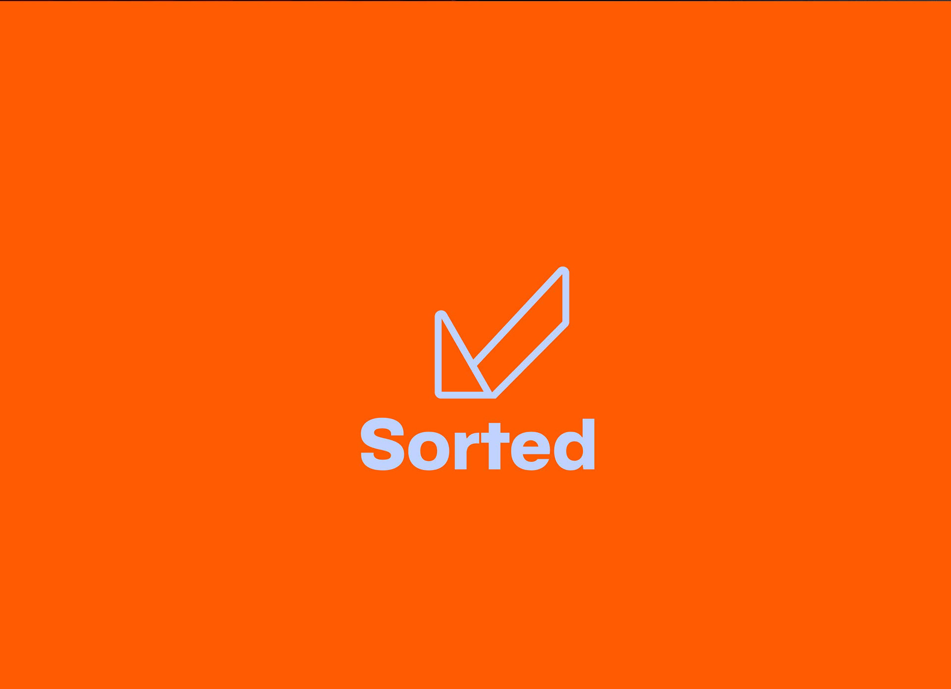
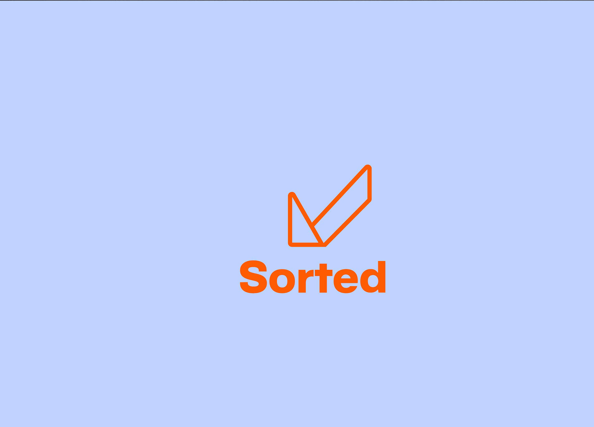
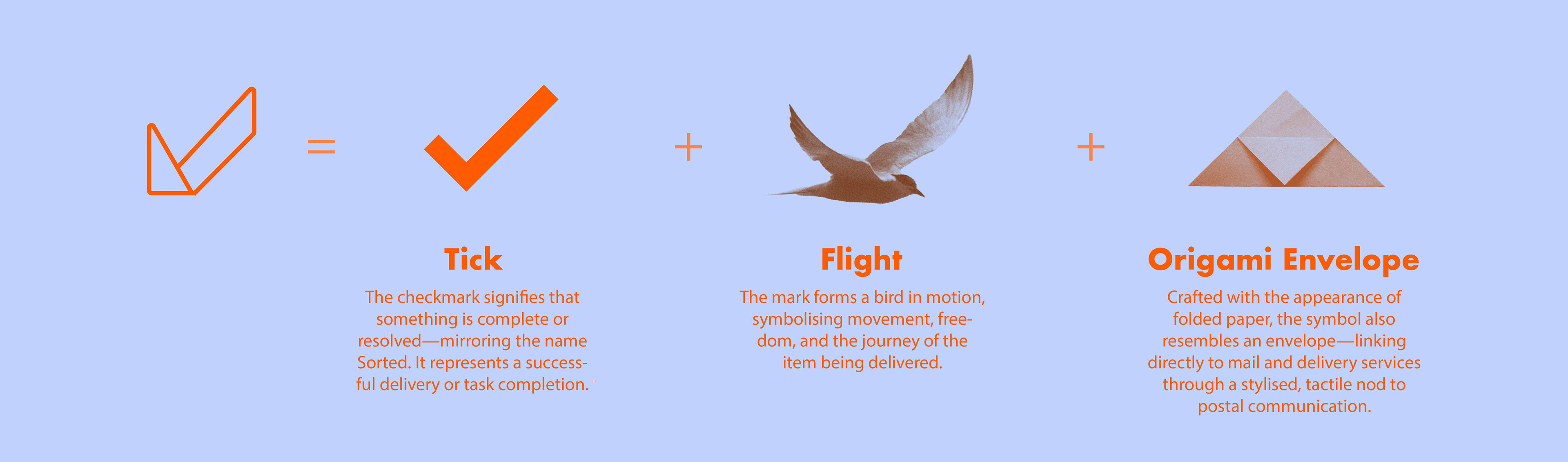
The new identity centred around a minimalist logo icon that distilled three key ideas into a single visual form:
Speed and mobility — represented by a bird in flight
Success and completion — conveyed via a checkmark
Postage and communication — echoed in the silhouette of a folded envelope
Together, these elements communicate the core promise of Sorted: reliable, streamlined delivery.
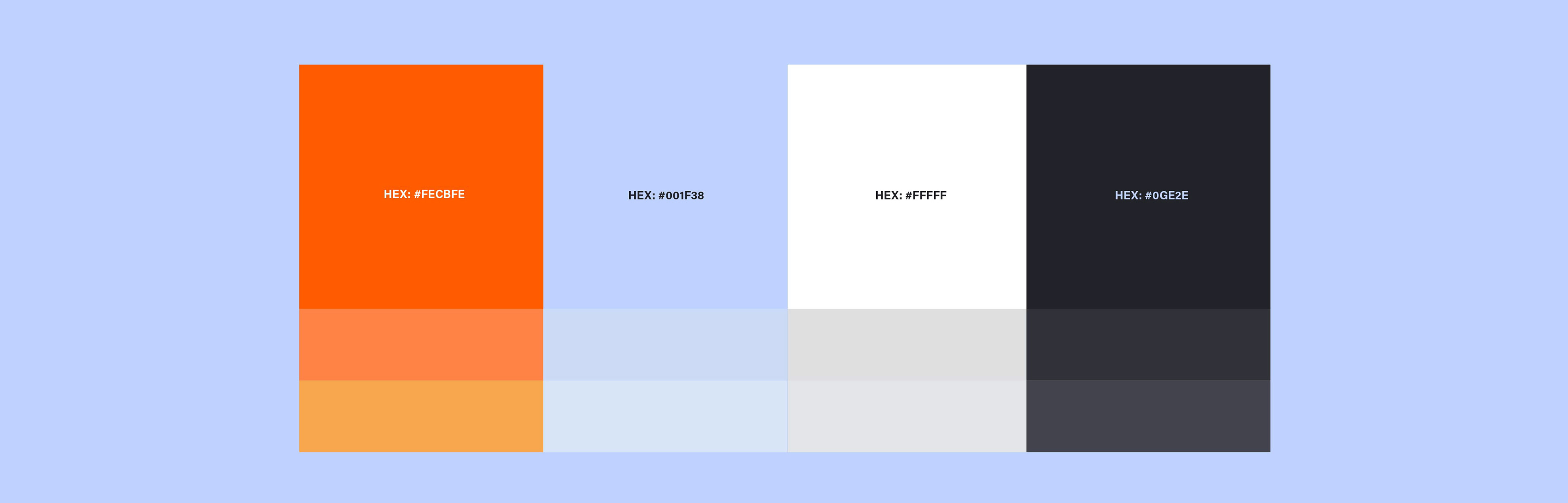
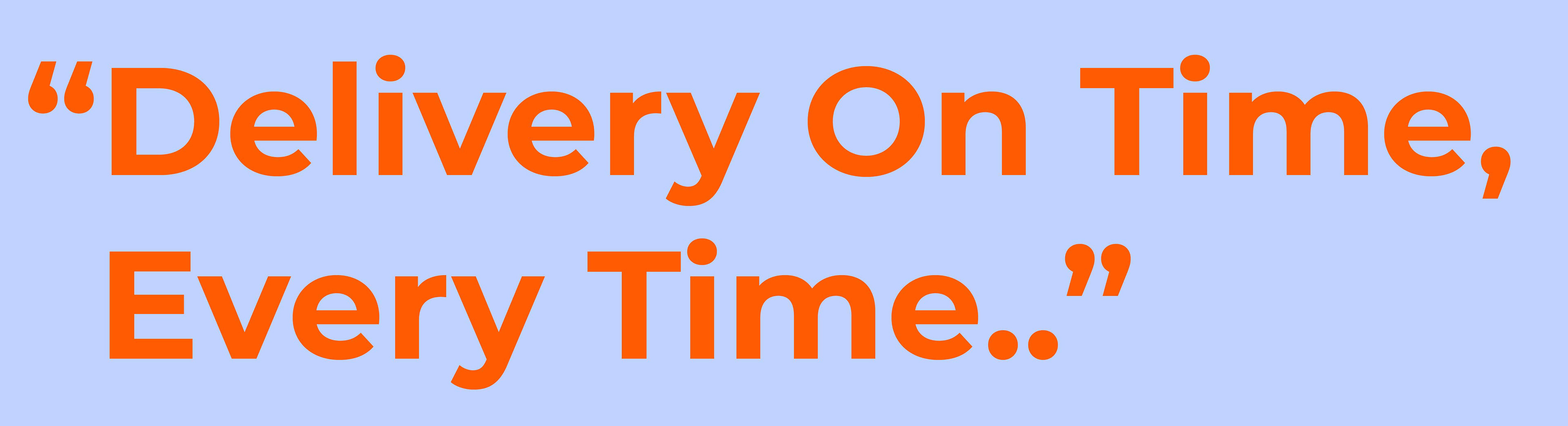
The accompanying typographic system balances modernity with approachability, while the new colour palette references heritage postal tones — specifically a bold, postal-inspired orange — reimagined with a contemporary edge.


Brand Evolution
The previous logo made use of a hand gesture symbolising task completion — a literal nod to the idea of being “sorted.” While this communicated a sense of finality, it lacked deeper visual cues tied to the broader delivery process, such as movement, speed, or the postal system itself.
Visually, the mark leaned toward a more complex and less contemporary form, which the client felt lacked the confidence, clarity, and modernity needed to reflect their current positioning. The updated logo builds on the core idea of successful delivery while introducing clearer, more versatile metaphors — all within a refined and distinctive mark that better aligns with Sorted’s evolving brand.
Sorted's Brand Performance
KPIs
Impact & Outcomes
Following the brand identity redesign in 2021, Sorted experienced significant growth and industry recognition:
- SaaS Platform Expansion: 2021 marked a 243% growth in shipments through Sorted's SaaS platform compared to the same month in the previous year.
- Global Recognition: Sorted was named by the Financial Times as one of the fastest-growing companies in Europe.
- Funding Milestones: In 2021, Sorted raised $40 million in a Series C investment round, following a $15 million raise earlier that year, bringing total funding to nearly $100 million.
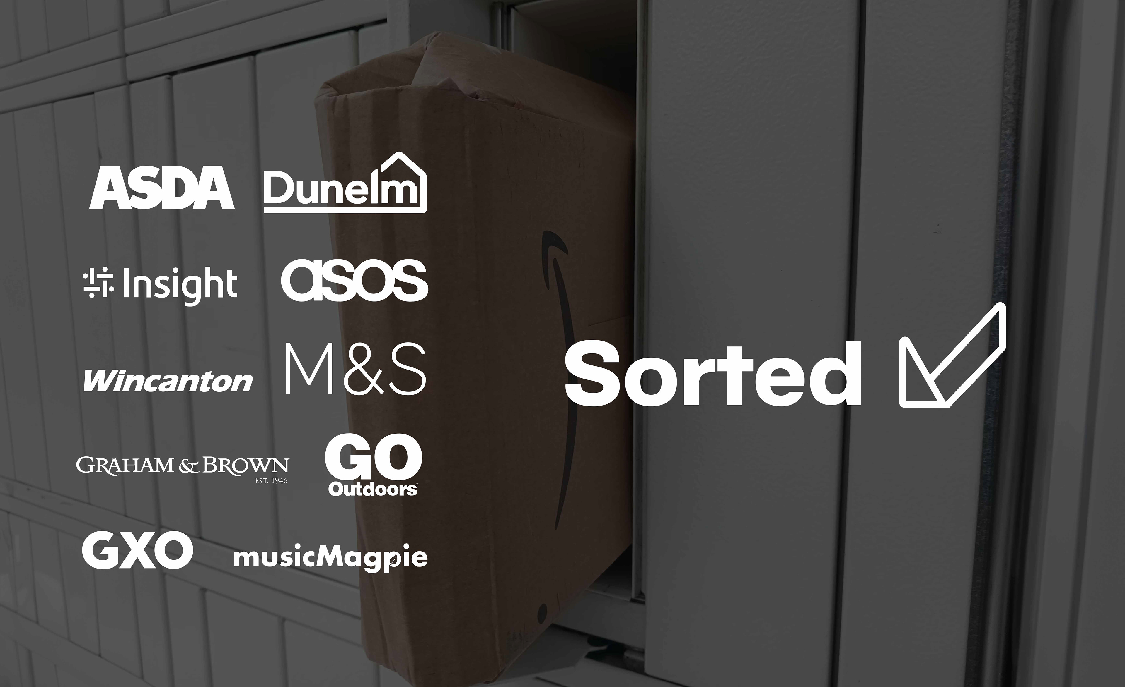
- Notable Client Collaborations: Post-rebrand, Sorted secured partnerships with leading retailers including M&S, ASOS, Dunelm, Go Outdoors, and Music Magpie.
These outcomes underscore the effectiveness of the rebranding initiative in enhancing Sorted's market position and appeal to top-tier clients.